|
|
|
|
Published by Yvette Depaepe in collaboration with Alfred Forns , Head of the Senior Critics
1x has a unique feature the founders are very proud of: the photo critique . Members can submit pictures to a team of knowledgeable senior critics. Their feedback is useful, interesting and enriching even for the best of us.
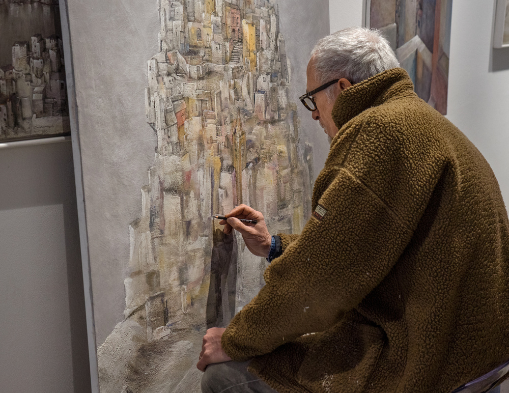
Critique on the photo ”Carlo” submitted by Lyn Hungerford
 Original image
In this image I wanted to show the painting emerging from the rough draft seen at the bottom, and make it become an imaginary cityscape through the articulated lines of the pencil.
Senior critic Darlene Hewson
I really like this. First of all, Carlo is a very talented man!
It definitely tells a story, it shows off his talent and it's a candid shot of him working his "magic".
My only suggestion for this image is to clone out the encroaching picture on the wall on the right top of the frame. It'll "clean" up the image and keep the viewers eyes on the subject.
Senior critic Nick van Dijk
An artist at work, strong portrait. I have only minor suggestions for you.
I think you should crop it. What you really want to see is the artist at work; all the rest is 'excess baggage' in my opinion.
So on the right .... his back is boring, don't need to be distracted by it: crop it just to the right of the painting behind his head. On the left side, your eyes wander to the painting and the light / dark on the wall: you don't want that, so crop straight down to the left of were the dark shadow ends on top. Last thing, slightly lighten Carlo's face.
Lyn Hungerford
Your critique is going against my grain... I actually did try the crop you suggested but discarded it because it's just part of me to want to include details of the environment... in this case his studio where he works... For me the artist's back is a part of the man at work. Thanks for ideas and suggestions... will undoubtedly roll them around in my head some more!
Senior critic Steven T
My vote is to leave the face colour as it is. On my monitor - to my eyes at least - it looks fine. I'm guessing he was illuminated by an overhead light of some sort - fluorescent, or maybe a skylight?
The painting may be acting as a reflector, bouncing some fill light towards the face. Come to think of it, that's a fascinating idea - that the painting is lighting the artist . . . . that the artist is becoming one with the painting.
You could crop closer still - but I would hate to lose much of the hunched back and shoulder. I think that hunch adds to the sense that the artist is concentrating intently on his work. One detail, though, is the bottom right corner. You could pull the coat down over that area easily with Photoshop's 'Warp' tool, or patch it with the Clone tool or Lasso it and use 'Edit>Fill>Content Aware' . That would simplify and avoid that minor distraction.
As for the right and left sides being distracting - maybe, rather than cropping, you could darken both slightly, and that would be enough to focus attention on the strong line made by the hands, shadow, and vertical details in the painting.
What fascinates me is the idea that he created that large, highly detailed painting with just that small pencil. Of course he used brushes too - but the image reminds us that he creates with just his mind, his hands, and simple tools. Photographers create with their minds, hands and some very expensive tools. : )
Senior Critic Johanes Januar
I've tested using screenshots to advise you to use a square format (hope you do not catch as the imposition of the will), I had to take the decision to reduce the back to remove anything that looks annoying, but I still "keep the canvas as complete as possible" because for me painting canvas painting + results should still be maintained.
In this square format, my attention focussed
1 on the expression of the painter who looked serious
2 full concentration on his right hand holding a pencil prudent
3 on his left hand placed on his left knee to maintain the stability of the body
Lyn Hungerford
I know it is so close to be a square! I tried it too but I wanted to keep his back and some of the studio.
Senior Critic Hilde Ghesquiere
My gage is attracted to the essence of the picture: the interaction of his eyes and his hand with the pencil as well as the shadow of his hand and back to his head.
As for the left and the right side, I would suggest to crop away a little bit at the right to remove the little painting on the right top. Certainly not much as Steven mentioned, you need the curve of his back. At the right bottom I would also use the clone tool to remove the triangle, as this is unimportant.
Steven's suggestion to darken both, the right and the left side is as for as I'm concerned the best solution. You don't loose the idea of his workspace and it doesn't disturb any more.
Concerning the colour of the skin, I would change the colour of his face a little bit, in my point of view, it's a bit too yellow as the light is different on his hands it should be slightly different. I would suggest to change it in PS with hue-saturation: hue -2 and saturation -14 both only on his face.
In addition I would also improve the brightness all over the picture.
Senior Critic José Hernán
I agree with my colleagues about some points.
I would also try to eliminate (not only darken) the other works of the artist on the left and right.
I did the try in PS and it is possible, with a little work. Using Lasso- Edit - Fill - Content Aware and easily with the Clone Stamp Tool.
For me - only my subjective impression - they are distracting elements. I would do the same with the small piece of the bank where the artist is sitting. That can you do with the same procedure (Lasso and so on).
I must agree also with Nick about the huge brown area occupied by the jacket of the painter. I don't know how you could find a better POV to show the personality and the work of Carlo, but in my opinion (excuse me if I am honest) now we can't see only his back and few from his face and expression...
The painting is also in a second place and for me, the shadow of the hand is not very nice.
Completing my try in PS with a screen shot I turned the picture to B&W (with Silver Effex) and (for me) it looks much better. The brown jacket is no more so prominent, the painting has more presence and there are no unnecessary colours to distract us. I think you can still improve your photo.
For next shots, I would try to show the face of Carlo. I think now of the many portraits that I have seen from Picasso, some of them very impressive. And not necessarily together with his work. Maybe the face of Carlo is also very expressive and impressive. I would like to see it!
 | Write |
 | Jane Lyons PRO The critique section is a wonderful part of a 1x membership. I am always grateful to have
their help and insight when I am unsure of an image. |
 | Johanes Januar CREW Quite happy to share and happy friends in need.
Regards |
 | Lyn Hungerford Many thanks Johanes! |
 | Kent Olsson PRO The strength of the critic section in action! |
 | Nick van Dijk Great team effort guys !! Thanks for the publication Yvette ';-D |
 | Yvette Depaepe CREW My pleasure, Nick! |
| Lyn Hungerford It's a lot of fun to put up your own images, especially when you receive such solidarity from all, regards Nick |
 | Jose Hernan Cibils Hi, Yvette, regardless that my critique appears in this article, it is a very good idea to publish regularly such things. They can show to the 1x users how works the Critique Section, how useful it is and it could also encourage to put pictures for the critique or to write some.
Congrats to Lyn!
Many greetings!
José H. Cibils |
| Yvette Depaepe CREW Hi José, of course this is the whole purpose of publishing critique. It works well apparently. And yes, I'm intending to publish a critique at least once in two weeks. It would be great if the team helps me to find real good ones ;-) Cheers, Yvette |
| Lyn Hungerford Many thanks José |