|
|
|
|
Published by Yvette Depaepe in collaboration with Alfred Forns , Head of the Senior Critics
1x has a unique feature the founders are very proud of: the photo critique . Members can submit pictures to a team of knowledgeable senior critics. Their feedback is useful, interesting and enriching even for the best of us.
Critique on the photo ”Willemstadt #2” submitted by Hans-Wolfgang Hawerkamp
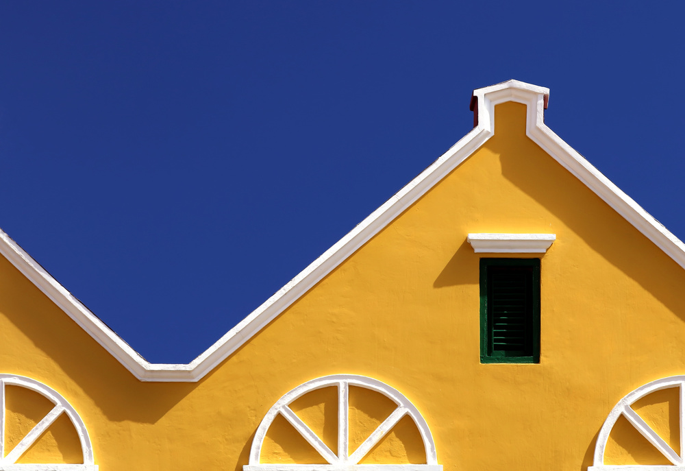
Senior Critic Norman Gabitzsch
This minimal rooftop is anything but boring. I like the horizontal symmetry of the three white arches in juxtaposition with the rectangular green window shades.
Then we have the triangular wave (that is Electrical Engineering speak) which is a symmetry shifted in phase by 90 degrees. The little "house" at the top of this triangular wave is a great feature adding to this image. This shot has novelty, curiosity, symmetry, antisymmetry, juxtaposition, and strong colours that go well together. I can understand why the curators spent a lot of time admiring this work, and why it is so well favoured!
Of course, you understand that I do not know what the Curators were thinking, but I will nitpick some possibilities. I like the colour of the sky, but on my main monitor it looks slightly unrealistic. I checked it out on a second monitor and still find it strongly pleasing... but slightly unrealistic. I don't really think the colours were the reason, however.
But along the top of the roof line, I see shadows of flaws in the roof that are making shadows. These shadowed flaws in the construction of this eye-catching building are a distraction.
The final thing that bothers me is the deep shadow on the green shutters. I would have liked to see a little more deep green and less shadow.
One last nitpick. The right hand side seems to be "heavy" and out of balance with the left!
Hans-Wolfgang Hawerkamp
I always try to improve my photography and anything from the critique section is helpful. I will assure that I didn´t change the colours, I only set the contrast in photoshop on automatic.
Member Flavio Marfa
I like this photo. I like to find the architectural details, and to see them in personal way, as in this image.
There is a very nice asymmetrical movement.
The yellow colour is solar it gives joy in contrast with the blue, the circles in lower part look like oranges. To me the cut of the image seems very precise. The visual weight is to the right and in balance with the blue triangle. In my eyes the colours seem natural. The light is intense but not too hard. The category “abstract” is fine but it could also fit in the category “architecture” to me. On the right side, the triangular line of the roof is interrupted and catch the attention on certain details and that is probably why you posted it in the abstract category.
This photo is very interesting for me. I like the combination of colours showing blue and yellow to the main attention. The white lines are eye catching, so is the green colour of the shutters. But to me, that touch of dark green is increasing the burden weight on the right side of the photo (personal sense of seeing the composition), although I know you tried to give a symmetrical impression when I look at all the elements that appearing on the left and the right, but still I feel a heavy burden on the right.
From my attention to your work, for example, as of this moment you show, I agree that this works well in the category “Abstract”
To answer your question “what do you think about the composition?” I will try to argue...
1. Cut the left side, make a symmetrical image (see the fourth element circle) with POV / POI green shutters. Show the vertical frame format 3 : 4 ..... I think this composition will be felt sturdy / robust if it intentionally we show green shutters into POV / POI in a new version.
2. Cut the right side, create a symmetrical image as well by using a 1/4 circle elements that appear on the left as a base to create new compositions, show this image using a square frame format (1: 1). I think it will not be less interesting if seen as abstract work in a more simple composition. For this second suggestion, it would not harm if you also want to try to rotate 180 degrees (image reversed).
 | Write |
 | Hans-Wolfgang Hawerkamp PRO Hello to all together,
I followed the recommendations of the Senior critics and created a new Picture. This pic, https://1x.com/photo/1318704/all:user:557959, is now in curation.
Many thanks to Yvette and Alfred for their effort to post this article.
Best regards Wolfgang |