|
|
|
|
Published by Yvette Depaepe in collaboration with Alfred Forns, Head of the Senior Critics
1x has a unique feature the founders are very proud of: the photo critique .
Members can submit pictures to a team of knowledgeable senior critics. Their feedback is useful, interesting and enriching even for the best of us.
Critique on the photo ”Lines and Loops” submitted by Bjorn Emanuelson.
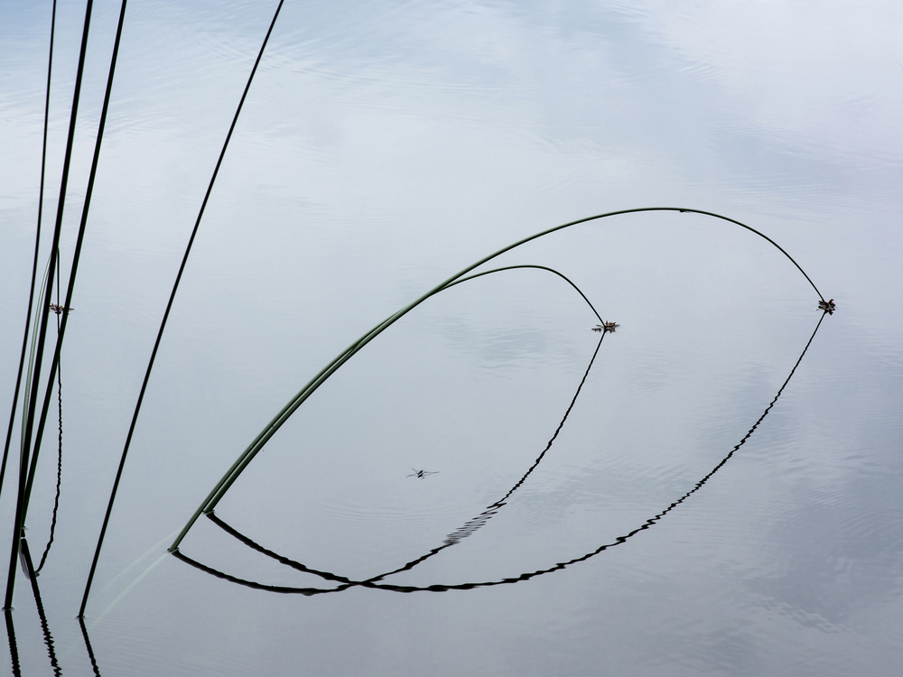
This shot was captured one a very calm day at a small lake in a deep forest. The idea was to create a nice composition of these plants and their reflections in the still water. There is also an insect ih the image. Should it be there or better not?
Please, give me your thoughts and some suggestions to improve this photo. Thanks on the forehand!
__________________________________________________________________________________
Member Calin Hanchevici
I like it's simplicity and composition and I believe you were aiming for the geometry. The insect brings a nice element to it.
I feel that the image is slightly disconnected. The vertical blades are geometrically separated from the arches. IMHO, there is not enough curvature on the last vertical one to bind the image together.
In an ideal world, the curvature would smoothly increase until the arches are formed. I hope you will find this helpful.
Reply Bjorn Emanuelson
Your idea on the curvature of the blades is very interesting. Much appreciated!
__________________________________________________________________________________
Senior Critic Theo Luycx
Nice image! I don't have any suggestions concerning the composition. It looks OK to me. A simple subject with delightful shadows/reflections.
Anyhow, Personaly I have two suggestions to improve this image.
Try them and see if the results pleases you.
The first advice would be to darken the water on the background. I'm sure there are enough details to give it more "body". Now, it looks pretty flat. If you darken the water, try to keep the subtle light green tones.
My second suggestion – a totally different approach - would be to try to reverse the photo to BW. If you have the NIK filters, experiment with them and look to the results.
Reply Bjorn Emanuelson
I highly appreciate your ideas to improve my image, Theo. The bright background was intentional but maybe I should think differently. Worth to try a BW version.
__________________________________________________________________________________
Senior Critic Steven T
This is a very subtle image - one that will reward viewers who spend some time exploring it. I like the precise alignment of the reeds - running parallel, almost touching, and then curving down and into the water where the quivering reflections take you back to the start.
As Calin pointed out, the water bug is a nice touch.
Because I love to tinker, if it were my photo, I'd be tempted to use Photoshop's 'Move' tool to put that bug in different positions to see how it adds to - or detracts from - the visual harmony. If it were moved right - to the lower right 'thirds' position, it would be more noticeable - but if it were moved to the left it could be one of those delightful 'surprise' details that we love to find in an image.
At a quick glance, the image appears black and white, but the delicate shades of blue in the water add to the 'subtle' theme - again, for viewers who will look a while longer.
Apart from that notion to move the bug around, I've no suggestions. It's a fine image just as it is. You have a good eye to see the beauty in this simple scene. Thank you for posting in Critique, and for including the exposure settings so we can learn from them.
Reply Bjorn Emanuelson
Thank for taking time to comment on my image, Steve. Much appreciated! I must say, I´m a bit reluctant to move around the bug in this type of image. In the category creative edit however, I don't hesitate to move around different elements.
__________________________________________________________________________________
Senior Critic Norman Gabitzsch
Simple and elegant. Nice lines and shapes. A very appealing minimal image.
Although I really like this work, I personally find the water bug to be distractive. It is well placed but unfortunately it is too small to be a substantial element adding to the scene.
A second thing to consider is the lighting. You might experiment with burning (darken) the blue in the lower right corner and bring out some of the blue in the upper frame.
I love what you have here, but subtle changes sometimes can leave a better impression on a photo like this.
Reply Bjorn Emanuelson
Thanks Norman! I also had my doubts about the bug and I think you are right there. I also tried burning parts of the image but I stayed with the lighter version since it was more to my vision of the moment.
 | Write |
 | Jose Hernan Cibils Great, Yvette! Thanks for this new publishing! |
 | Dominic Schroeyers Good work! Great article and good suggestions made. |
 | Nick van Dijk Hi Yvette, great work putting this together again! And great work 'team' !! |