|
|
|
|
Published by Yvette Depaepe in collaboration with Alfred Forns, Head of the Senior Critics.
1x has a unique feature the founders are very proud of: the photo critique
Members can submit pictures to a team of knowledgeable senior critics. Their feedback is useful, interesting and enriching even for the best of us.
Critique on the photo ”Dinner at Nonnas 1” submitted by Bernardine de Laat
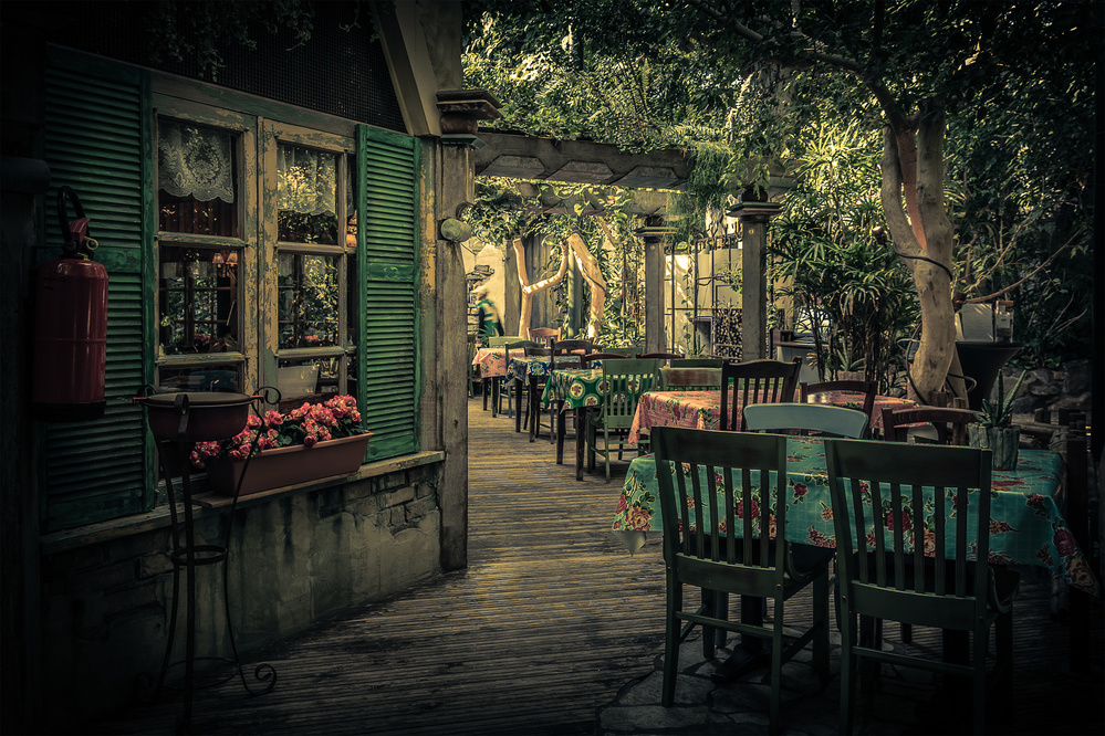
"Dinner at Nonnas 1" by Bernardine de Laat
We went for dinner (during our holiday) at this place and it felt like we went back in time, grandmothers time to be exact. So many details in this restaurant, the tables covered in colorful flower tablecloths, the wooden tables and chairs, the windows, the curtains, the wooden floor, I felt like I walked into a completely different dimension and we enjoyed our time and our diner here very much. This shot was taken the day after because I asked the owner if it was alright to take some shots before opening hours.
__________________________________________________________________________________
Senior Critic Theo Luycx
Difficult to answer your question why this image is not published, Bernardine. The only thing I can do is giving you my personal vision and my ideas about composition.
In this lovely image called "Dinner at Nonnas 1", you say that there is much to see and that is true.
But to me, there is a main subject missing, catching immediately the eye and leading the viewer into the picture.
The first overall look of course also depends of personal taste, especially for photo's like Nonnas.
What do you really want to show us, this very nice looking dinner room or the mood?
Let me begin with the dinner room, starting from the right side (the table) and going into the depth. That doesn't work because automatically me eyes go to the left side with the windows and the flowers which is eyecatching. The window in the back of the dinner room is not that interesting.
The window with the flowers should be the main subject.
A small crop on the right side would give a more restful impression and a much better focus on the main subject, imho.
Second, I would straighten the table and chairs a little bit.
This is my personal opinion, of course. The composition like it is, looks a little too busy. The question remaining is: will the viewers not be overwhelmed with so many details.
I hope I do not disappoint you with my comment trying to give you my very personal vision. Let's see what the other senior critics think about it.
Bernardine de Laat
Thank you so much for your honest opinion. When you are very much in love with a picture it's hard to look at it differently so your comment opened my eyes. I am not disappointed at all I am here also to learn so I take every advice I can get. Thank you so much for your vision and help.
__________________________________________________________________________________
Senior Critic Dominic Schroeyers
While looking at your picture and finding the right words, I saw Theo's reaction appearing.
Basicly, my comment joins his comment.
I like your picture, it has a certain mood. It is a busy picture with lots of different textures, but I feel they are in harmony with each other.
Why is it not published?
We can only guess, but I think there is some in Theo's words. There is something missing. Some subject that grabs all attention.
Lets look at your beach photo's. What do they all have in common? They are all very simple and minimalistic. (I like that) But, they have all one standing out subject. A dune, a sign, a cabine, a laying chair,... That is what makes a picture very interesting.
Dinner at Nonnas certainly isn't bad. It is also not a simple or minimalistic picture. It is a harmonous chaotic picture. :) But, it needs a clear subject.
I see a man passing in the background, bit it is not clear enough to be a main subject. A person, sitting at one of the tables deeper in the picture, reading his paper or drinking a coffee, that would be nice.
All the rest of the technical details, such as the toning you used, the vignetting etc, they are just about personal taste and lesser important, in my opinion.
Bernardine de Laat
Thank you also very much for your comment and tips I really appreciate it that you guys take the time to look at my photo and give your personal opinion.
__________________________________________________________________________________
Senior Critic Greg Barsh
The thumbnail caught my eye, so I thought I would chime in also!
Like Theo and Dominic, I looked through your portfolio, and saw a diversity of subjects and approaches. Of the Nonna images, I like this one the best, largely because of the near to far directionality--this makes me feel like I want to walk down the path around the corner and see what's back there!
I think Dominic and Theo have provided some interesting feedback, so I'll suggest two additional ideas.
The red object on the wall on the very left (fire extinguisher?) is somewhat distracting.
I assume that's why you used a strong vignette, but if you had the owner's permission, it might have been better to remove it for the photo.
Along the same lines, I think the flowers in the window box on the left are a very nice touch and provide an additional leading line towards the path; I think it would be even better if the black iron stand on the left had not been in the image.
With regard to composition, I wonder if the sense of directionality could have been even stronger, had the foreground part of the path been a little wider and not interrupted by the table in front.
You didn't say what settings you used for the capture (please try to do that next time!) but I wonder if a position that was a little bit closer and to the left, but with a wider focal length, could strengthen the effectiveness of the path as a central element.
Bernardine de Laat
Thank you so much for your comment, I take it all with me to try to improve myself next time.
__________________________________________________________________________________
Senior Critic Andreas Agazzi
As a lot has been already said and I fully agree with all statements below I just wanted to bring in another topic that in my opinion is essential and valid for all of us.
No matter whether I have a look at your beach images or the series 'Dinner at donnas', they all have one in common - a very distinctive and unique style, especially the post processing work.
That distinctive and unique style is very key and you can consider yourself as being very lucky as you found a way to set a signature below your images that is different from many other good work that is shown here at 1x.com.
Your style is in my opinion very pleasing, has always a relaxing note (even in such a vibrant scene like here) and is meanwhile linked to your personality - your images are meanwhile ease to recognized to be one of yours. To find your own and unique style I consider this part to be one of the hardest achievements in photography. Technically a lot can be taught and refined, but finding your own handwriting is something that cannot be conveyed by other persons, it has to be developed out of your sole and heart. In my opinion you achieved this very well!
I know that it can be very frustrating if images get rejected. But at the same time it is in my opinion also very crucial not to get discouraged. Improvements are always possible and also necessary, but you have found and set your frame, the further development should not be deviated as long as you are convinced about the outcome, an outcome in your very personal and appealing style. You are right with the statement in your introduction for this image: 'I think it is an amazing and moody shot' - I think so too.
 | Write |
 | Nick van Dijk Excellent work 'team' and well chosen and presented Yvette (as always) !! Grtz, Nick |
 | Yvette Depaepe CREW Thank you, Nick ;-) |
 | Siarhei Mikhaliuk * With pleasure read. I did not expect it to be so interesting.
For a few minutes, I myself changed the understanding of the photo. Thank you. |
| Yvette Depaepe CREW Thanks for your appreciation, Siarhei! |