|
|
|
|
by Di Tommaso Angelo
Published the 6th of July 2020
A few years back I was asked to participate in a contest.
The theme was Seven Deadly Sins. I always liked that theme, and I was happy to have an opportunity to try. I was sure that most of the participants would submit stereotypical images.
Moreover, at that time I was having fun using textures and post-processing images.
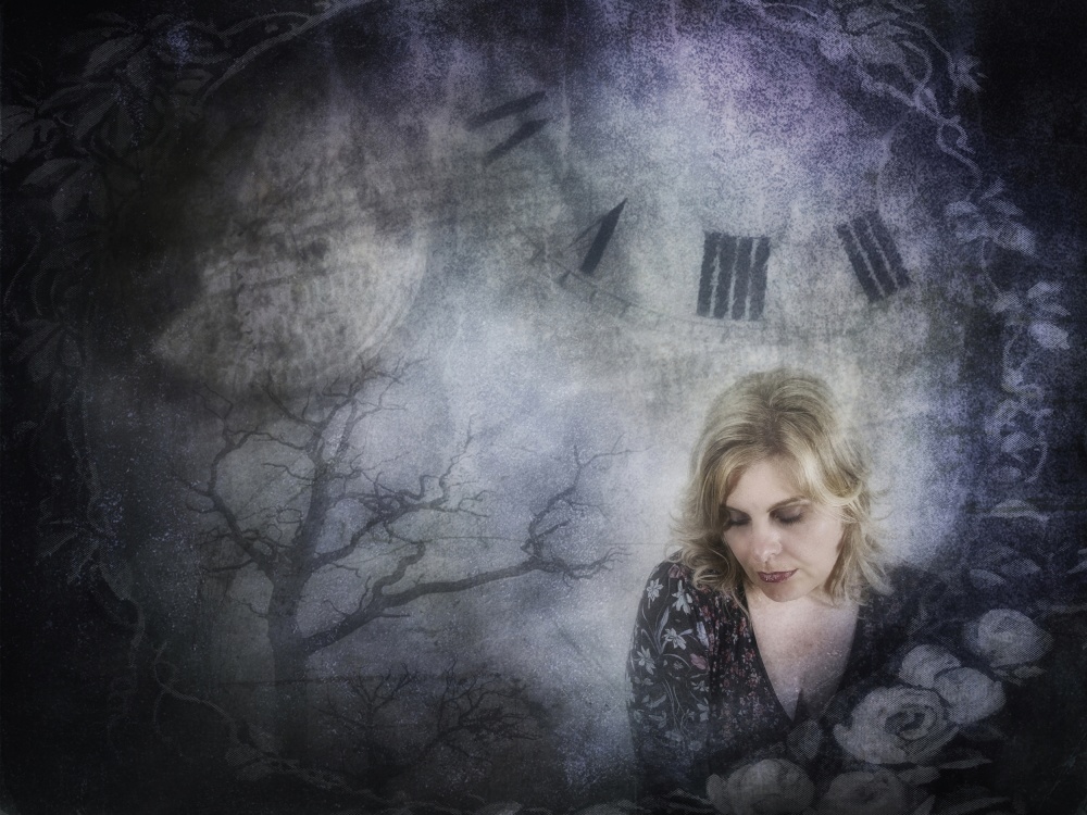
'SLOTH' by Di Tommaso Angelo / Canon G11 . f/2.8
The idea of a sloth immediately came to mind for the theme, and I envisioned an image that could represent the slow, flowing movement of time. For me, the sloth concept evokes feelings of solitude and sadness. That's why I came up with the idea to position the main subject in the bottom corner of the composition, taking up only a small portion of the frame. I wanted the other elements to play important roles and contribute to the overall impression I intended to portray: a depressing composition, a dry tree representing sadness and solitude and obviously clocks, representing time moving at a sluggish, slow-moving pace.
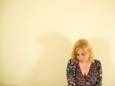
"I usually take photographs of several girls for my portraits, but when I have to create significant, committed images, I always take photos of my wife, who without fail produces exactly the right look."
I usually take photographs of several girls for my portraits, but when I have to create significant, committed images, I always take photos of my wife, who without fail produces exactly the right look. I took the main image at home. The model sat in front of a white wall, and I intentionally composed the image as a head and shoulders shot, placing her in the bottom-right corner of the frame. I used a very simple lighting setup (as you can see by the shadows cast on the wall in the image below): two halogen lights with 150-watt incandescent light bulbs — one on the right side and one on the left of the model.
For the image I had in mind I needed some textures. I am a Flickr member and I’m in a few textures groups. Some members let people use their images with a Creative Commons license. I searched and found what I was looking for. These are the other images I used.
Texture #1 — Clocks

I used the top area with the two clocks from this image.
Texture #2 — Frame
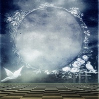
I used the texture form this image.
Texture #3 — Overall Toning

I used this texture for its tones, to characterize the image
and to uniform the hue of the portrait with the hue of the other images.
Texture #4 — Dead Tree
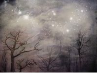
I used the tree in the bottom corner from this image.
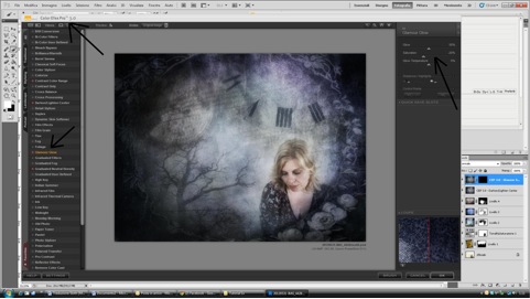
POST PROCESSING
To process and create the montage I used Photoshop and Nik Software's Silver Efex Pro and Color Efex Pro plugins.
1) First I changed the white balance in Photoshop by applying a Photo Filter adjustment layer. In the Adjustments panel, click on the drop-down menu in the top-right corner, select Photo Filter and then apply the filter that suits you. I selected a cooler filter that removed a lot of the warm tones produced by the halogen lights.
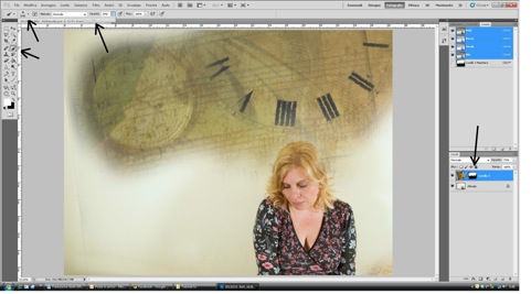
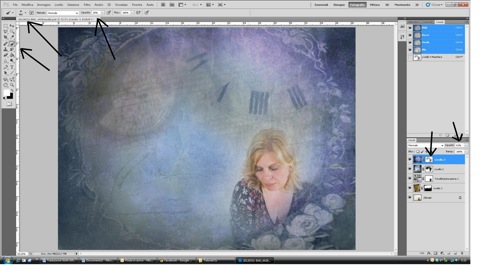
2) I added the first sloth component — the element of time. I opened the clocks file and dragged-and-dropped that layer onto the main image using the Move tool. Next, I used the Move tool to adjust the size of the clocks until I was satisfied with the way they looked. To do this, make sure Show Transform Controls is selected in the Move tool's options box. That way the Move tool's handles will be visible around the image. To delete portions of the clock image that I did not want to use, I created a layer mask and painted over them using a large Brush (500–700 pixels). I then decreased the clock layer Opacity to 73% to reduce the intensity of the hues.
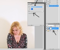
3) The clock layer was still a bit over-saturated, so I desaturated the colors by applying a Hue/Saturation adjustment layer, reducing the Saturation to –53 without changing the other values.
I didn’t want to alter the main subject’s tones, so I created a layer mask for the Hue/Saturation layer, and using a black Brush I painted over the model to prevent her from being desaturated.
4) Next, I added the frame. As in Step 2, I opened the file and used the Move tool to drag the frame texture onto the work area. I enlarged the layer using the Move tool to extend the edges of the frame to the borders of the canvas, and I set the frame's layer Opacity to 86%. Then I created a layer mask and using a fairly large Brush (1000 pixels) with a Hardness of 30%, I painted over the main subject and the clocks to reveal those areas in the underlying layers.
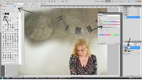
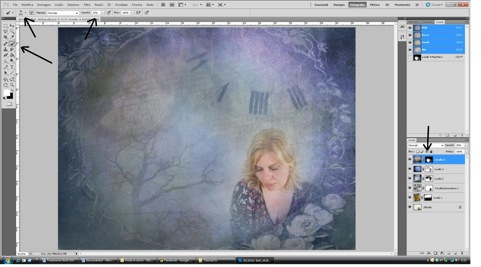
5) Now I had to create a more unified overall tone for the different images, so I opened the third texture, and again used the Move tool to drag the layer onto the canvas.
6) I added the last element — the dead tree. I opened the photo, dragged the layer onto the canvas, positioned the tree where I needed it and resized it with the Move tool. I wanted the tree to be barely visible, so I set the layer Opacity to 35%. I added a layer mask and used a large Brush to delete all extraneous parts of dead tree texture layer, leaving only the tree.
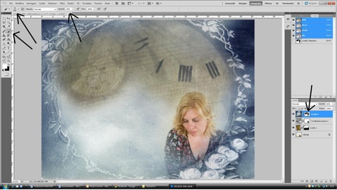
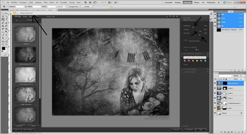
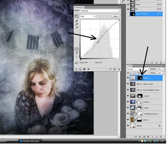
7) Now that all of the elements were in the image, I had to make some final adjustments. I first exported the image to Nik Silver Efex Pro plugin to convert the image to black and white. I left the default settings in the left column. Under Global Adjustments, I decreased Brightness to 22%, but increased Contrast to 44% and Structure to 40%, creating a more dramatic, contrasty effect. Once I was happy with the result, I clicked OK, which produced a new monochromatic layer on the top of Photoshop's Layers Panel. Reducing the black and white layer's Opacity to 40% subdued the colors of the image.
8) I exported the image to Nik Color Efex Pro plugin and applied the Darken/Lighten Center filter. I wanted to darken the edges of the image to direct the viewer's eye to the main subject. I set Shape to an oval, moved the Center Luminosity slider to 10%, the Border Luminosity slider to –67% and the Center Size slider to 55%.
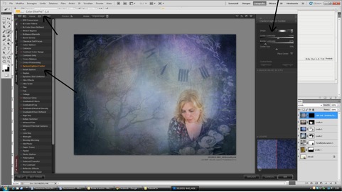
9) To soften the image I used Color Efex Pro again, applying the Glamour Glow filter with Glow set to 50% and Saturation to –20%. This created another new layer in the Layers Panel.
10) At the end of my work, I realized I could have slightly increased the contrast of the face. So back in Photoshop I applied a Curves adjustment layer. I increased the highlights and decreased the shadows, creating a slight S-shaped curve. I then added a layer mask to the Curves layer and painted over the model's face, applying contrast only to that area of the image.
At that point I was satisfied with the result. The image is a faithful representation of what I had in mind at the beginning.
TIPS
I believe that nowadays technique should help creativity. Even without professional photography gear, you have the ability to produce great images if you have ideas and passion.
BIOGRAPHY
I'm from Italy and I’ve been taking photos since 1990. I moved from the darkroom to Adobe Lightroom with a new enthusiasm. I’ve had 20 personal exhibitions, participated in 40 group exhibitions, received two honors from AFI (Artist of Italian Photography) and from AFIAP (Artist of the International Federation of Photographic Art), and have received about 30 awards over the years. Many Italian photography magazines have published my images. I spent six years working as a photographer, and from 2010 to 2014 I was president of Fotoamatori Sangro Aventino photography club.
 | Write |
 | Bego Amare PRO This is awesome, thanks so much for explaining the whole process with such detail |